Convay Cloud
Convay Cloud was built to solve a growing challenge: how to manage files in a platform handling hundreds of meetings, chats, and shared documents across 46+ countries. I helped design an intuitive cloud system that organizes everything, from transcripts and recordings to chat files and shared photos, so users could find what they need, when they need it.
CATEGORY:
Web Design,
Product Design
ROLE:
UX Designer,
UI Designer,
Interaction Designer,
Information Architect
TOOLS:
Figma

Convay at a Glance
Convay is a video conferencing platform built for modern collaboration. Unlike traditional tools, it supports the full meeting lifecycle, from scheduling and hosting to AI-powered transcription, file storage, and post-meeting follow-ups.
Designed with scalability in mind, Convay now supports meetings with up to 10,000 participants and is trusted by governments and international organizations in over 46 countries.
Key features include:
High-quality video and audio conferencing
AI-based transcription and meeting summaries
Cloud storage for meeting files and chat logs
Real-time whiteboard, chat, and screen sharing
Enterprise-grade security with on-premise and cloud options
Convay brings everything into one platform to simplify meetings, improve productivity, and support high-stakes collaboration at scale.
Convay has been used in global events like SIDSSA 2025 and secured a €5M government contract through its scalable architecture and reliable UX.
Visit convay.com to learn more.
Feature Overview
Convay Cloud brings structured cloud storage into the heart of the platform. It organizes files across three key categories: Meeting Files, Chat Files, and Media, making it easier for users to stay in control of their shared content.
Users can quickly browse, filter, and search through transcripts, agendas, recordings, shared media, and more, without digging through endless folders. With a clean navigation system and a dedicated Activity Log, teams can track edits, shares, and uploads, ensuring visibility and collaboration without chaos.
Problem Statement
As Convay grew, users began struggling with a fragmented file experience. Meeting recordings, transcripts, and chat documents were stored across separate flows, leading to confusion, duplicated effort, and lost information.
Without a centralized and organized system, even basic tasks like finding a transcript or revisiting shared files became time-consuming, especially for teams working across multiple projects. This lack of structure affected collaboration speed, user trust, and product scalability.
Convay needed a file system that was not just storage, but smart, intuitive, and built for real-time teamwork.
My Role and Responsibilities
I led the UX design of Convay Cloud from concept to handoff, working closely with developers and product managers to create a clean and scalable file system.
Key responsibilities included:
Designing the full navigation flow across Files, Photos, and Activities
Structuring folders for Meeting Files and Chat Files to reduce clutter
Introducing clear labeling, icons, and tags for quick file identification
Conducting usability testing to validate hierarchy and discoverability
Delivering detailed Figma specs and components for seamless handoff
The goal was to bring clarity to complexity, making file access intuitive for users across roles, from internal teams to government stakeholders.
User Interface Designs
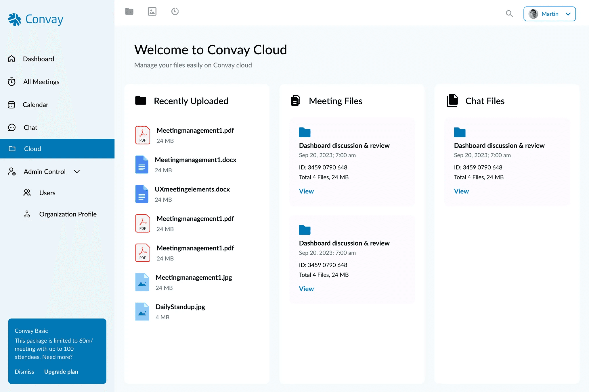
Convay Cloud Dashboard Page: The dashboard displays three categories: Recently Uploaded Files, Meeting Files, and Chat Files. Users can navigate easily through different meeting folders, chat folders, and view relevant files. This helped users quickly jump to what they need without unnecessary clicks.
Convay Cloud Dashboard Page
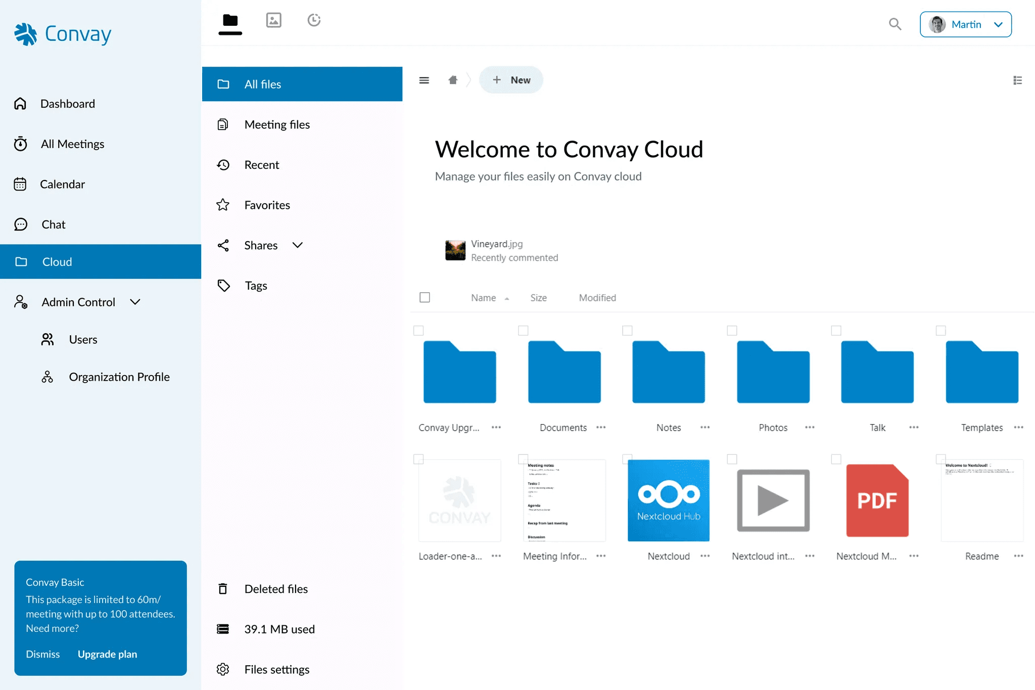
Files Navigation: The Files section includes a left-hand sidebar for navigating between categories like Meeting Files, Recent, Favorites, Shares, and Tags. Nested folders under “Shared” allow users to filter by shared with you, shared by you, or shared by link. The layout reduced clutter and helped users manage large volumes of content easily.

Files > All Files
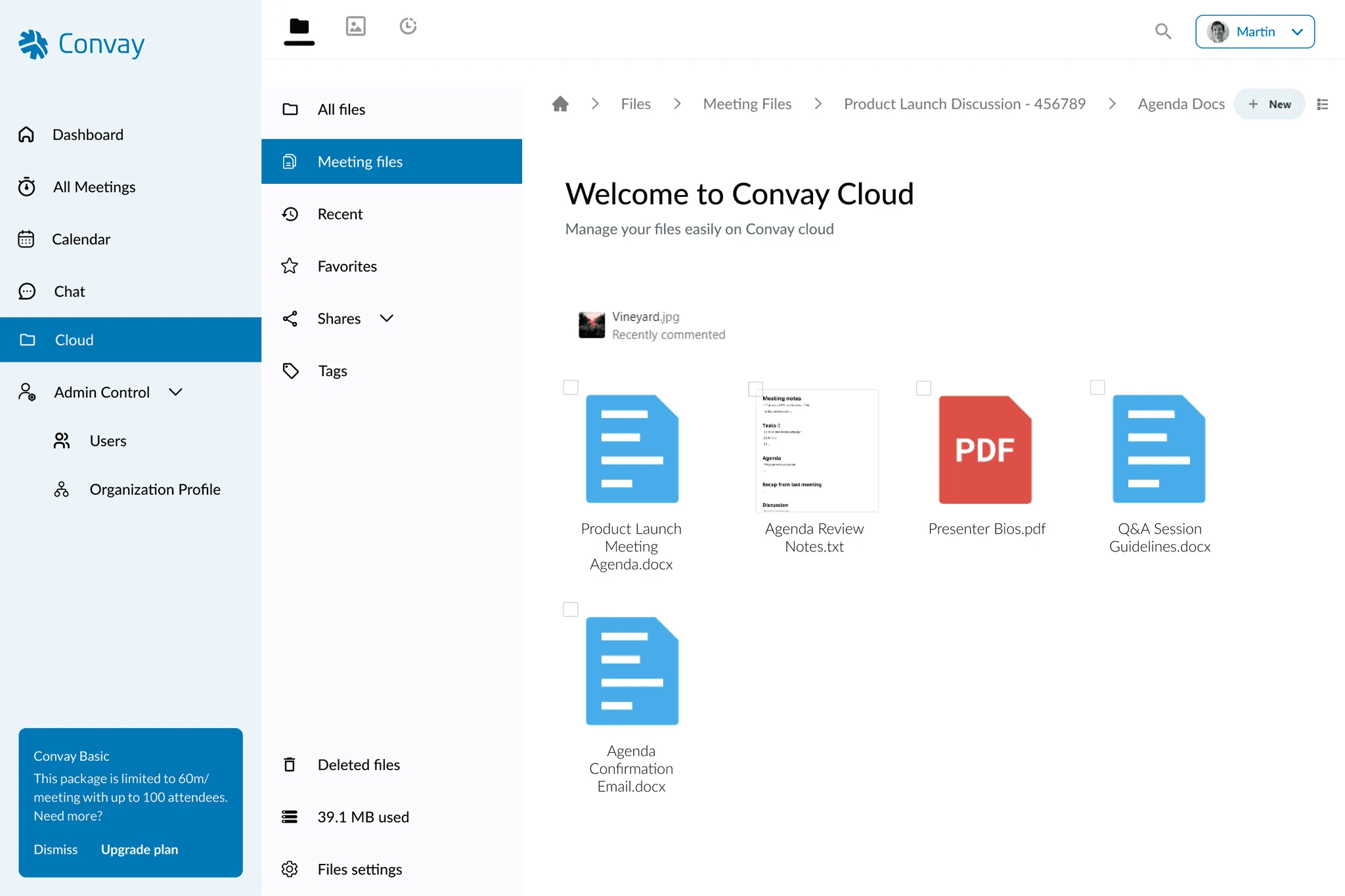
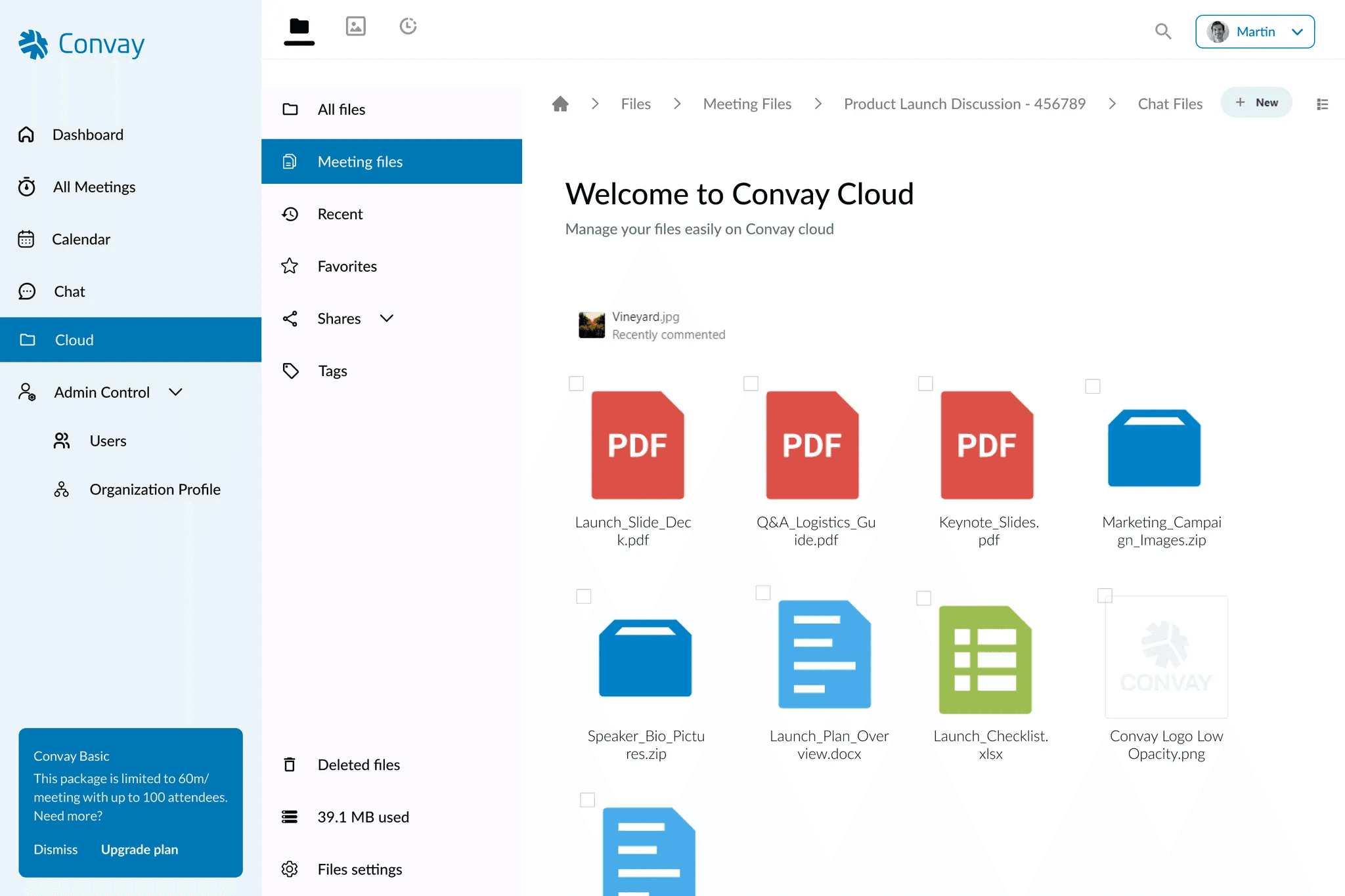
Meeting Files Structure: Inside the Meeting Files view, users see folders for each recorded meeting. These folders hold structured content like Meeting Information, Agenda Docs, Recordings, Transcripts, and Chat Files, making it easy to locate specific documents linked to a particular session.
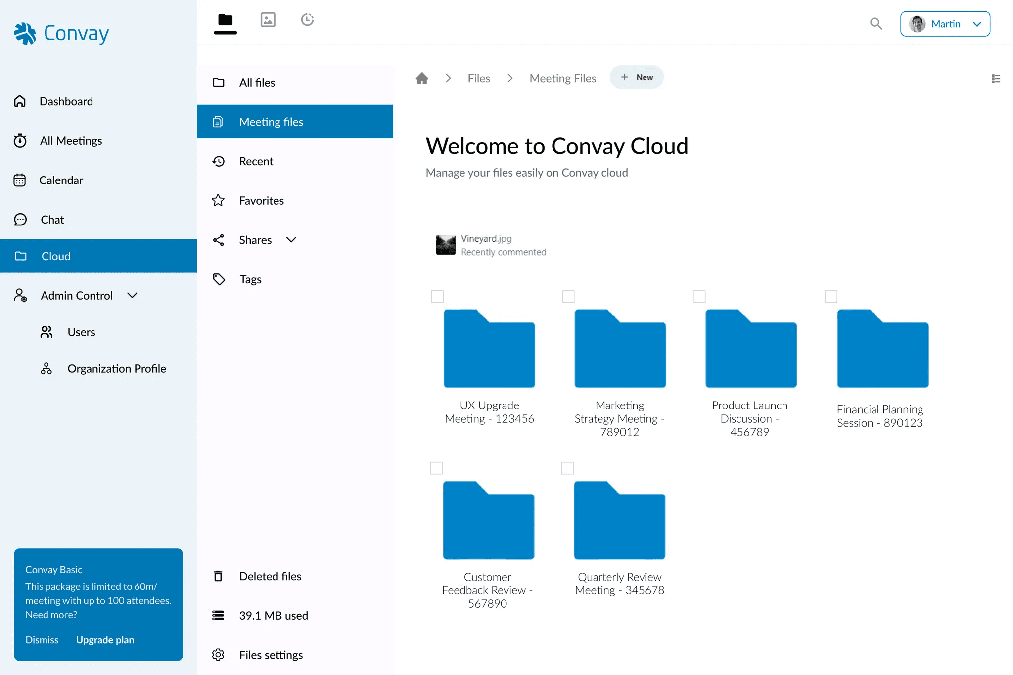
Files > Meeting Files
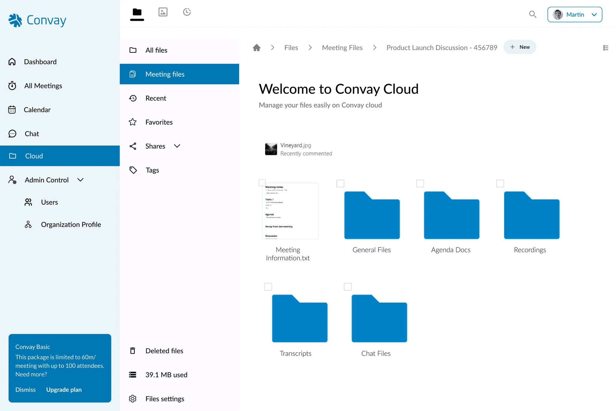
Files > Meeting Files > “Specific Meeting Folder”

Files > Meeting Files > “Specific Meeting Folder” > General Files
Files > Meeting Files > “Specific Meeting Folder” > Agenda Docs

Files > Meeting Files > “Specific Meeting Folder” > Recordings

Files > Meeting Files > “Specific Meeting Folder” > Transcripts
Files > Meeting Files > “Specific Meeting Folder” > Chat files
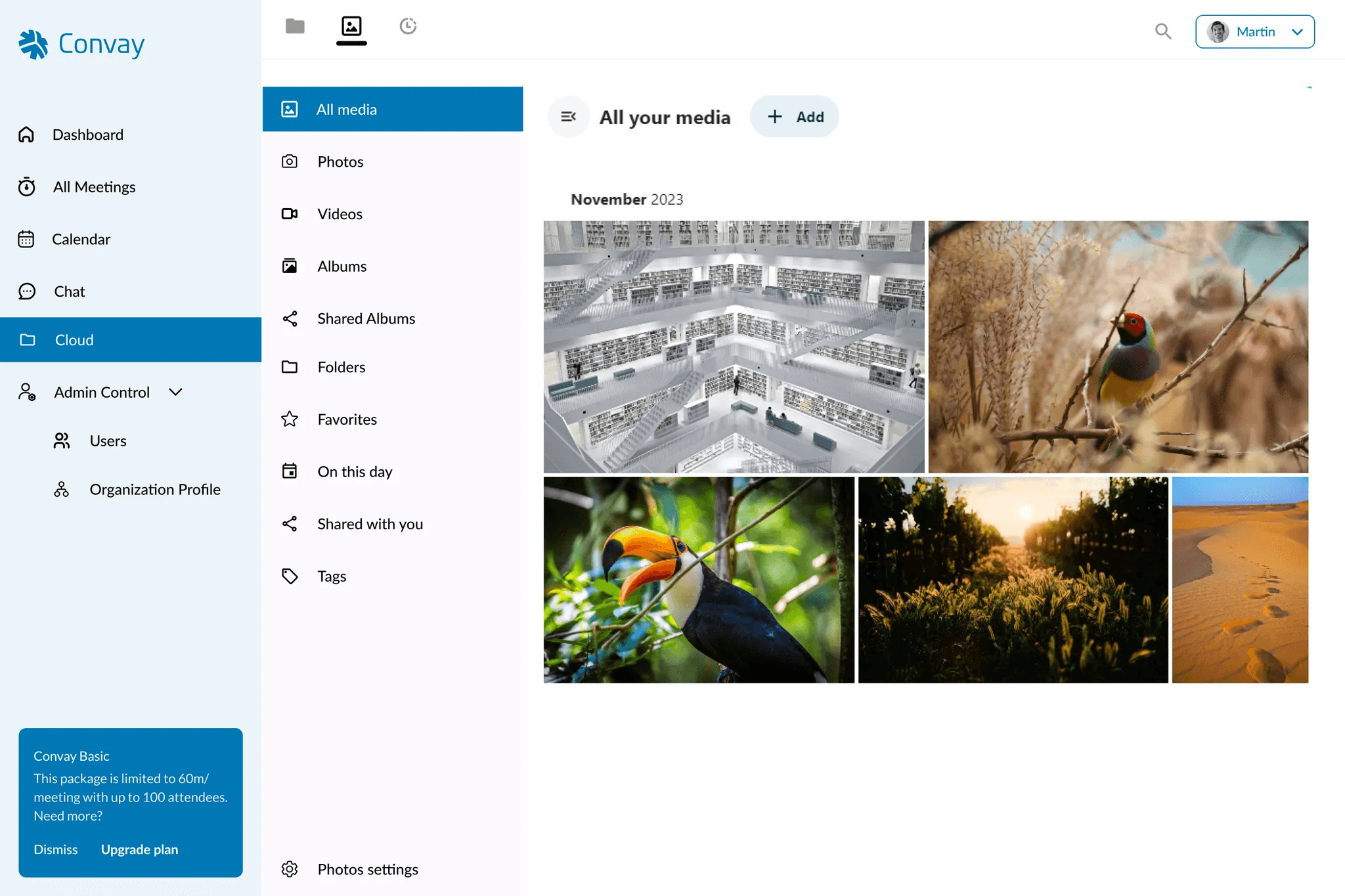
Photos Navigation: The Photos section separates all visual content into All Media, Photos, Videos, Albums, and Tags. Users can also view Shared Albums, improving collaboration for media files shared in meetings or team spaces.
Photos > All Media
Activity Log: This tab keeps track of all actions—file uploads, edits, deletions, and shares. Users can view logs by All Activities, Activities by You, or Favorites, helping teams stay in sync and accountable.
Activities > All activities
Challenges and Solutions
Challenge: Users couldn’t easily find specific files
In early versions, users often got lost navigating unstructured folders, especially when handling dozens of meeting files and chat attachments.
Solution: We introduced a hierarchical structure that mirrored how users think: by meeting or by conversation. Grouping files into Meeting Files and Chat Files, and organizing content by type (recordings, transcripts, agenda, etc.) helped reduce friction.
“I finally know where to look when I need
last week’s transcript. It just makes sense now.”
– Internal testerChallenge: Navigation felt too complex
Users struggled with overloaded navigation and unclear entry points into file categories.
Solution: We simplified the top navigation into three key icons: Files, Photos, and Activities, and kept category-specific views inside. This reduced decision fatigue and helped users get to the right file type faster.
Challenge: Too much content made the interface feel overwhelming
With hundreds of uploads across users, some folders became difficult to scan and manage.
Solution: We added filtering and tagging to let users quickly sort through files based on recency, type, or tags. We also built nested views under “Shared” files to split content by sharing method (with you, with others, by link, etc.).
Challenge: No visibility into file activity
Users had no way of knowing who made changes, when files were added, or what actions were taken.
Solution: We introduced a detailed Activity Log, split into All, By You, and Favorites, so users could track updates and stay informed.
Outcome and Impact
The Convay Cloud feature improved both usability and strategic positioning of the platform:
30–40% faster file retrieval in internal testing, especially for meeting-related documents.
Reduced support queries from users struggling to locate files, saving time for both users and admins.
Improved collaboration, as teams could now share meeting materials without confusion or delay.
Increased user satisfaction, with testers noting the clean layout and intuitive organization.
Enterprise-ready structure with activity logs and file categorization helped build trust with clients managing sensitive information.
Strengthened Convay’s ecosystem by supporting the full meeting lifecycle—from scheduling to post-meeting documentation.
“I don’t have to ask around anymore.
Everything I need is just… there.” — Internal Tester
While external rollout was still pending, early usage within internal teams showed strong adoption potential.
Takeaways
Designing Convay Cloud helped me see how even the simplest tools, like folders and filters, can become powerful when rooted in real user needs. It wasn’t about reinventing cloud storage. It was about removing friction, reducing clutter, and making information feel easy again.
This project also reminded me that clarity wins. When navigation feels obvious and organization feels natural, users stop thinking about the interface, and just get things done.
“People don’t notice design that works.
That’s the point.”
It’s a lesson I now carry into every design, no matter how small.