Convay Personalization
As Convay expanded to serve government and enterprise clients, organizations needed the platform to feel like their own. I worked on a white-label personalization system that allowed clients to customize everything from logos to themes, aligning Convay’s interface with their brand identity. The feature empowered teams to create branded experiences across meetings and dashboards, reinforcing professionalism and ownership on a platform used by 10,000+ users across 46+ countries.
CATEGORY:
Web Design,
Product Design
ROLE:
UX Designer,
UI Designer
TOOLS:
Figma
Convay at a Glance
Convay is a video conferencing platform built for modern collaboration. Unlike traditional tools, it supports the full meeting lifecycle, from scheduling and hosting to AI-powered transcription, file storage, and post-meeting follow-ups.
Designed with scalability in mind, Convay now supports meetings with up to 10,000 participants and is trusted by governments and international organizations in over 46 countries.
Key features include:
High-quality video and audio conferencing
AI-based transcription and meeting summaries
Cloud storage for meeting files and chat logs
Real-time whiteboard, chat, and screen sharing
Enterprise-grade security with on-premise and cloud options
Convay brings everything into one platform to simplify meetings, improve productivity, and support high-stakes collaboration at scale.
Convay has been used in global events like SIDSSA 2025 and secured a €5M government contract through its scalable architecture and reliable UX.
Visit convay.com to learn more.
Feature Overview
The Convay Personalization feature allows organizations to visually tailor the platform to match their brand. It includes two main categories:
Organization Branding:
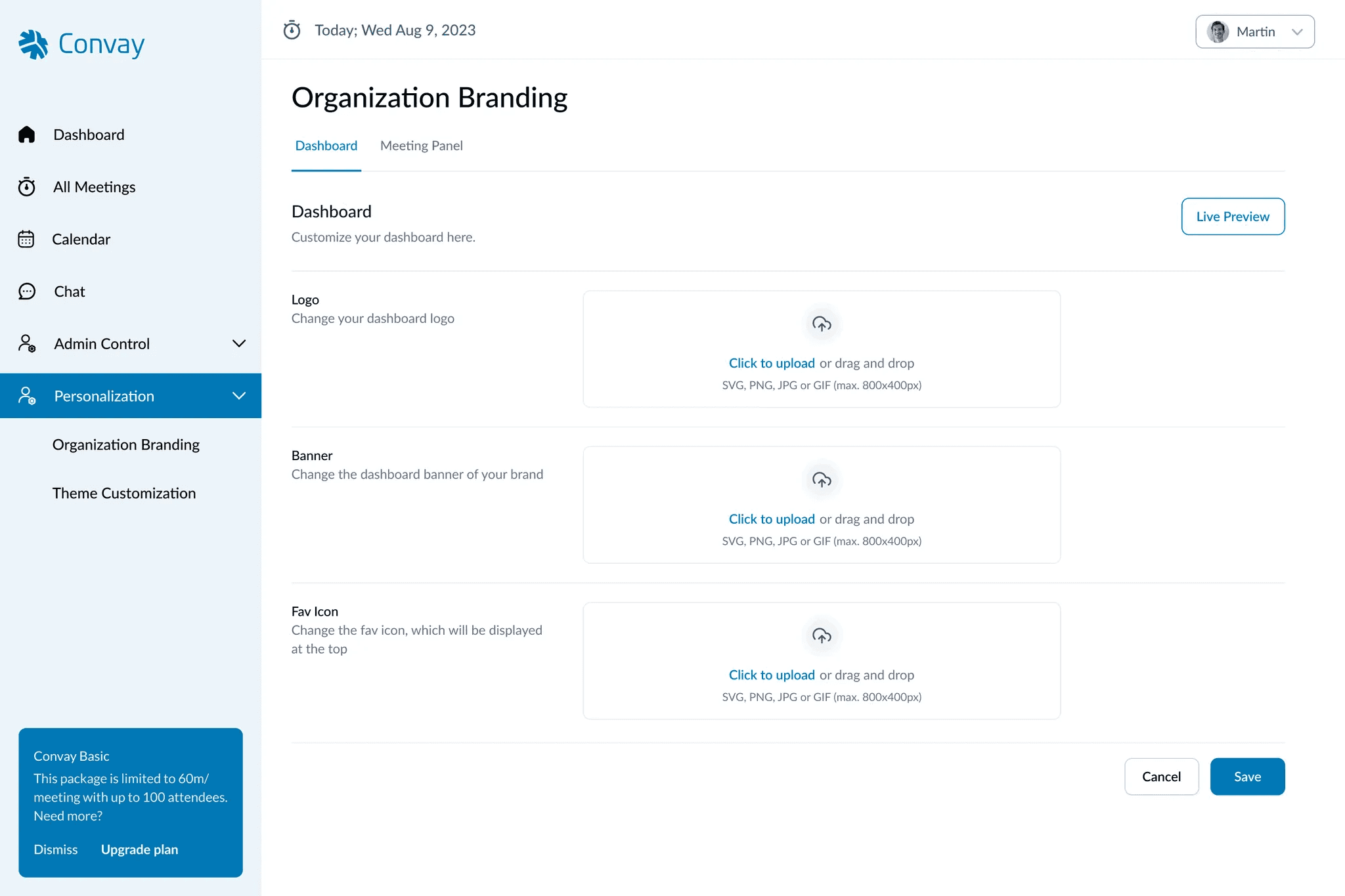
Dashboard Customization: Users can update the dashboard logo, banner, and favicon to reflect their brand.
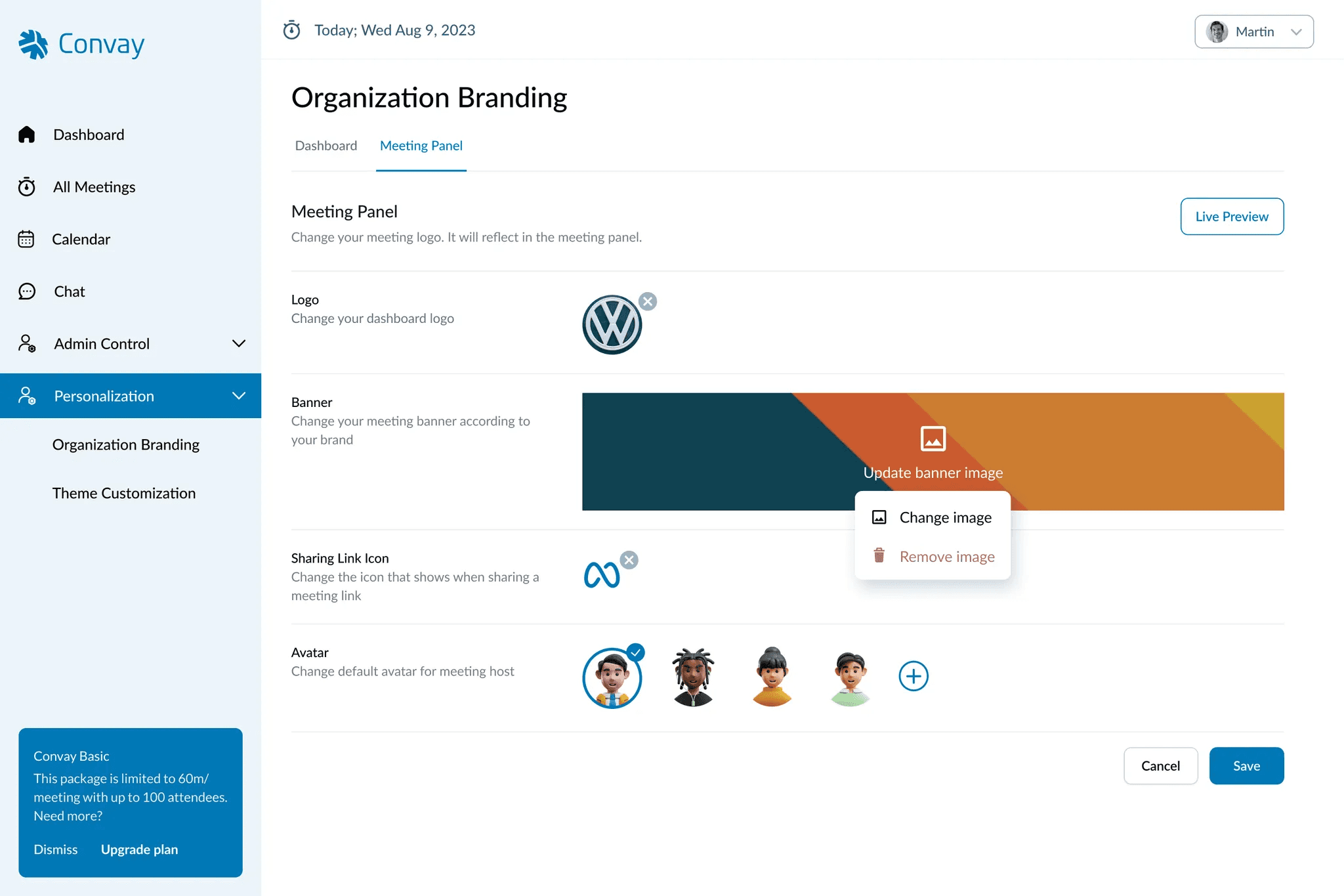
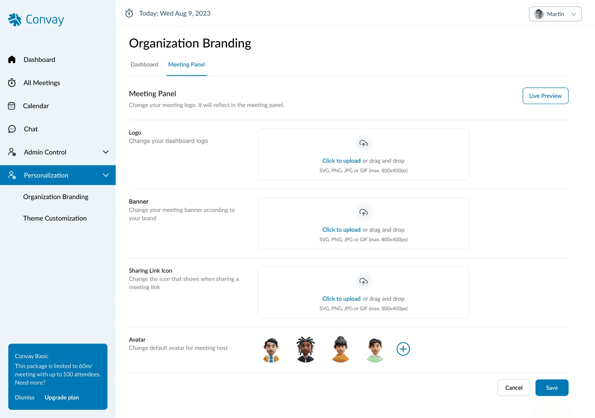
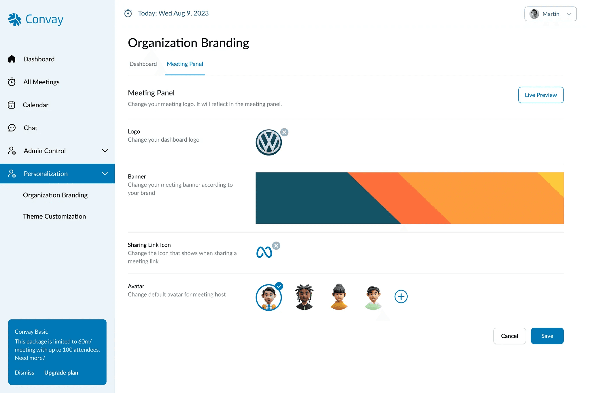
Meeting Panel Customization: Users can personalize the meeting panel by updating the logo, banner, sharing link icon, and host avatar.
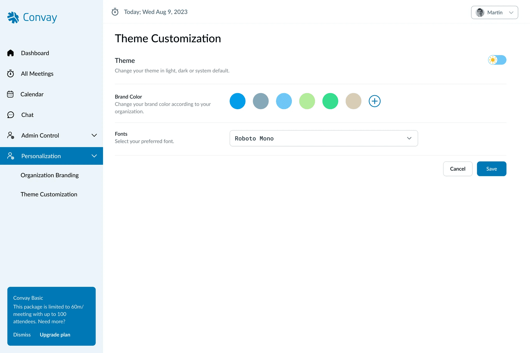
Theme Customization:
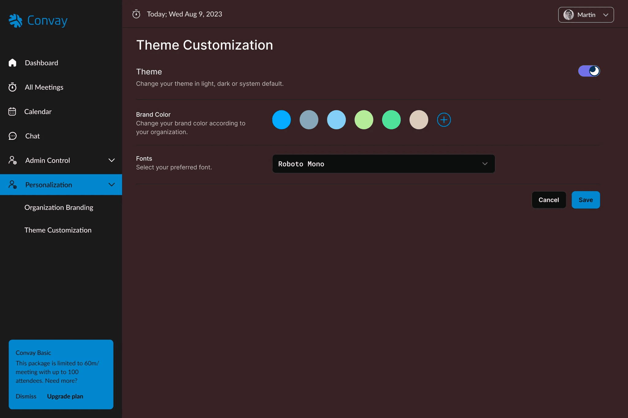
Users can choose between light, dark, or system-default themes.
Brand color and preferred fonts can be customized to match the organization’s visual identity.
The goal of this feature is to help organizations create a cohesive branding experience across the Convay platform.
Problem Statement
As Convay expanded into enterprise environments, many organizations needed a way to visually align the platform with their own branding. Without built-in customization, the platform’s default look felt generic and inconsistent with company identities, especially in client-facing meetings. This gap reduced users’ sense of ownership and weakened brand presence during key interactions. To address this, Convay required a scalable white-labeling solution that would let teams easily apply their logos, banners, colors, and themes—without compromising usability.
Goal
The goal of the Personalization feature was to empower organizations to seamlessly reflect their brand identity across the Convay platform. By introducing customization options for dashboards, meeting panels, themes, fonts, and brand colors, the feature aimed to create a cohesive and professional user experience. Whether hosting client-facing meetings or managing internal collaboration, users needed a system that felt like an extension of their brand—enhancing trust, familiarity, and visual consistency throughout the platform.
My Role and Responsibilities
As the UX Designer for the Personalization feature, I was responsible for creating an intuitive interface that allows users to easily customize Convay’s visual elements. My tasks included designing the layout for the Organization Branding and Theme Customization sections, defining the customization options available for each category, and ensuring a seamless user experience when updating elements like logos, banners, colors, and themes.
User Interface Designs
We designed the interface to keep customization simple, focused, and brand-aligned — dividing it into two distinct parts: Organization Branding and Theme Customization.
Organization Branding
Dashboard Customization: Users can upload their own dashboard logo, banner, and favicon, replacing Convay’s default elements. This ensures the main platform landing page feels like a natural extension of their brand.


Meeting Panel Customization: Users can personalize their meeting environment by updating the meeting panel logo, banner, sharing link icon, and host avatar. These updates create a more branded and professional feel during live meetings, especially in client-facing contexts
Theme Customization
Users can choose from light, dark, or system-default themes.
A brand color picker allows for selecting from predefined swatches or entering custom HEX codes.
A font selector dropdown offers popular web-safe fonts for easy branding alignment.
The interface is modular and previewable, meaning users can instantly see how changes affect the UI before saving, ensuring confidence with every customization.
Challenges and Solutions
Challenge: Balancing Simplicity with Flexibility
Users needed a range of customization options to reflect their brand, but too many settings could feel overwhelming.
Solution: We grouped settings into two intuitive categories, Organization Branding and Theme Customization, allowing users to find what they need without cognitive overload. This made the system feel flexible yet simple to use.
“It took me just a few minutes to make Convay
look like our own product. Super intuitive.”
— User during pilot testingChallenge: Maintaining Brand Consistency Across Interfaces
Without coordinated customization, branding could feel disjointed between dashboards and meetings.
Solution: We introduced separate customization options for both the Dashboard and Meeting Panel under Organization Branding. By allowing users to apply their brand’s logo, banner, and other elements in both spaces, the design ensured a consistent experience that reinforces brand identity.
Challenge: Making Color and Font Selection Intuitive
Users needed freedom in theme styling without the risk of poor choices or technical hurdles.
Solution: We included both a predefined palette for quick selection and a custom color input for brand accuracy. For fonts, we offered a dropdown of widely-used options, no need to upload files.
Challenge: Supporting Dev Handoff for Customization
To ensure what users designed actually matched their brand in production, we needed clear consistency between design and implementation.
Solution:I collaborated with developers to define how logo assets, color variables, and font tokens should be mapped directly into front-end code, helping preserve visual fidelity and reducing rework.
Outcome and Impact
The Personalization feature gave Convay a competitive edge by enabling organizations to truly make the platform feel like their own. With just a few clicks, users could align the platform with their brand, from colors and fonts to dashboard and meeting visuals.
Improved brand alignment: Organizations reported feeling more ownership of the platform, especially in client-facing scenarios where branding matters most.
Faster onboarding: The simplified customization flow reduced setup time, making it easier for new teams to get started with a branded environment.
Stronger engagement: Internal analytics showed that teams who activated personalization settings were 18–22% more likely to continue using Convay after the first month (based on internal retention benchmarks).
Developer alignment: Clear UX handoffs ensured that what users designed was accurately reflected in implementation, minimizing back-and-forth and preserving visual consistency.
“Now Convay looks like it belongs to us,
it feels like part of our company.”
— Client team lead
This feature didn’t just add flexibility; it deepened user trust, enhanced professionalism, and reinforced Convay’s positioning as an enterprise-ready collaboration platform.
Takeaways
Designing the Personalization feature was a lesson in balancing freedom with clarity. Users needed the ability to make Convay feel like their own, but too many choices could easily become overwhelming. The key was in creating structured flexibility, giving enough control without cluttering the experience.
This project deepened my understanding of how brand identity plays a psychological role in user engagement. When people see their logo, colors, and fonts reflected in the tools they use, it builds a sense of ownership and pride. That insight will stay with me as I continue designing for teams and products that rely on emotional connection just as much as functionality.
“People don’t just use products,
they want to see themselves in them.”