Desserts Shop
The Convay Design System was developed to bring consistency, scalability, and efficiency to Convay’s platform. With no prior design system in place, I built a complete framework from scratch, defining reusable elements like colors, typography, spacing, and components. This system ensures a cohesive user experience across light and dark themes and across devices, making it easier for the design and development teams to maintain a unified look as Convay evolves. The result is a flexible, user-centered design foundation that supports Convay’s current and future growth.
ROLE:
UX Designer
TOOLS:
Figma
CATEGORY:
Design System, Web Design, Mobile Design, Responsive Design, Accessible Design

About Convay
Convay is an innovative video conferencing platform that redefines virtual collaboration by integrating tools for seamless communication and teamwork. Designed with the needs of modern businesses in mind, Convay goes beyond traditional video calls by offering a unified platform that manages all aspects of meeting lifecycles—from preparation and execution to post-meeting follow-ups.
The platform provides enterprise-grade security, ensuring data privacy with end-to-end encryption and secure cloud storage. Key features include high-quality audio and video conferencing, automatic transcription, real-time collaboration tools, and centralized file management through Convay Cloud. Users can organize meeting files, access chat logs, and navigate through media and documents effortlessly. Additionally, Convay supports complex requirements with scalable architecture, making it suitable for organizations of all sizes.
With specialized solutions like AI-powered transcription and summarization, cloud storage for document management, and an intuitive interface for navigating content and activities, Convay aims to create a truly cohesive virtual meeting experience that enhances productivity across teams.
For more details, visit Convay.
Overview
Convay was an established platform when I joined the team, but it lacked a cohesive design system. My role was to revamp its design, integrate new features, and introduce scalability by building a design system from the ground up. With no previous system in place, I developed a robust structure to unify Convay’s visual elements, streamline future updates, and enhance user experience. This design system, created from scratch, standardized every detail—from colors, spacing, stroke widths, and corner radii to typography, shadows, and grid layouts. The goal was to ensure consistency and visual harmony across the platform, allowing Convay to deliver a seamless and recognizable experience to users.
Defining Global Variables
To build a scalable design system, I started by defining global variables for Convay. These variables include foundational elements like colors, spacing, stroke widths, and corner radii, which create a consistent look and feel across the platform. By centralizing these core design properties, we can quickly make updates or adjustments across the entire platform without manually editing individual components.
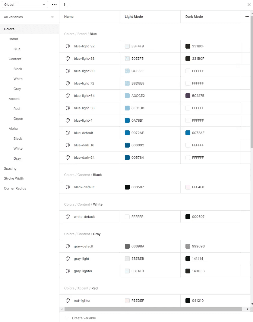
Color Variables: I defined a palette of brand colors and content colors, with different shades for light and dark modes. Each color has specific uses, such as distinguishing primary actions from secondary ones, ensuring clarity and consistency throughout the interface.
Spacing: To maintain uniformity in layout and padding, I established a range of spacing variables (e.g., XXS, XS, M, L, XL). This spacing structure supports flexibility across different screen sizes while keeping the design cohesive.

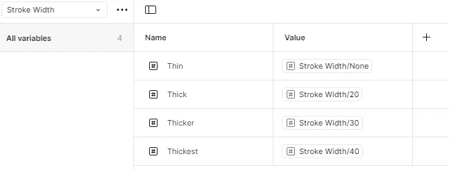
Stroke Width: Stroke widths were standardized with variables like "Thin," "Thick," and "Thickest" for borders and outlines, ensuring that lines maintain a consistent weight throughout the platform.
Corner Radius: For rounded elements, I defined corner radius variables ranging from "None" (sharp corners) to "XX-Large" and "Circular," adding visual balance and hierarchy depending on the element’s function.

These global variables form the backbone of Convay's design system, allowing the team to apply consistent styling across multiple features quickly and effortlessly.
Establishing Styles for Text, Effects, and Grid Layouts
After defining the global variables, I moved on to setting up Figma styles for text, effects, and grid layouts. These styles are essential for ensuring a unified appearance across the platform and enhancing readability, visual hierarchy, and accessibility.
Text Styles: I created a comprehensive set of text styles to cover various use cases, including titles, subtitles, body text, and captions. Each style was carefully defined with font size, weight, and line height for both web and mobile. This typographic system ensures consistency in text presentation across different screens and enhances the readability of content.

Effect Styles: To add depth and focus to elements, I developed elevation (shadow) styles in both light and dark modes. The shadows range from subtle (Shadow 02) to more pronounced (Shadow 64), allowing us to highlight elements based on their importance. For example, higher shadow values are applied to modals and pop-up elements to help them stand out against the background.

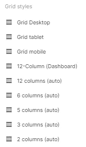
Grid Styles: For a structured layout, I established grid styles for different devices and layouts, including desktop, tablet, and mobile views. These grids, such as the 12-column layout for dashboards and adaptive columns for various sections, support a flexible and responsive design. By using a standardized grid, we ensure that components are evenly aligned and that the platform scales smoothly across different screen sizes.
These style definitions add structure to Convay’s design, ensuring that text, effects, and layout grids remain consistent and visually appealing across various components.
Applying the Design System to Components and UI Elements
With the foundational variables and styles established, I applied these elements to create a cohesive, scalable design system for Convay’s UI components. This step involved building out reusable components using the defined colors, text styles, spacing, stroke widths, and effects, ensuring each part of the UI adheres to the new design standards.
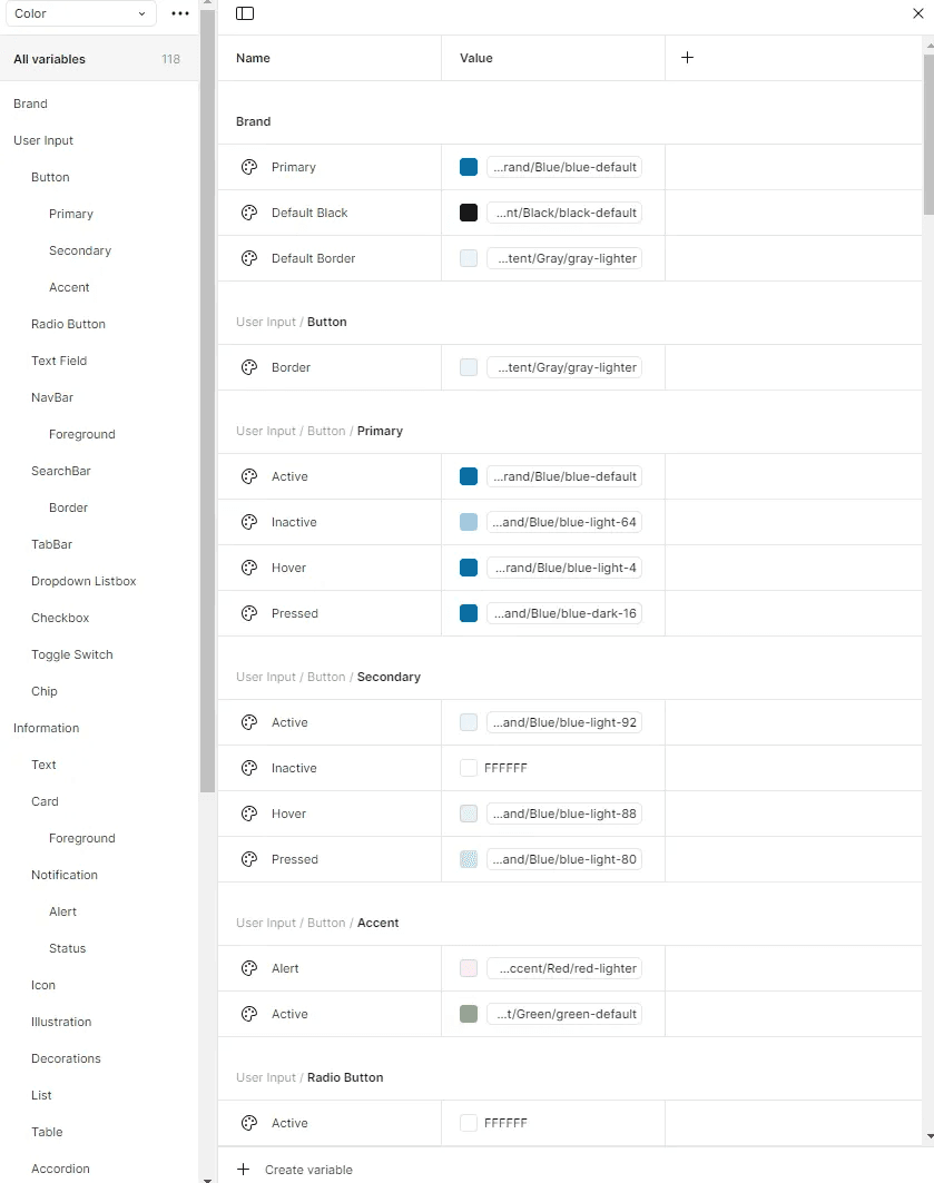
Buttons: I used the global color variables and spacing options to design different button states, such as primary, secondary, active, hover, and pressed. Each button is visually consistent with the brand colors and provides clear feedback to users during interactions, enhancing usability.
Icons and Badges: The icons and badges across Convay were updated to align with the new color scheme, using accent colors for alerts and notifications. Each icon’s stroke width and corner radius were adjusted based on the defined variables, ensuring they are visually harmonious across all screens.
Forms and Input Fields: The design system also covers form components, including text fields, dropdowns, checkboxes, and radio buttons. Using standardized text styles, colors, and spacing ensures that all forms look consistent and feel intuitive, reducing cognitive load on users.
Modals and Dialogs: Modals were designed with proper elevation styles to give them prominence on the screen. The standardized corner radius and shadow effects make dialogs visually distinct, helping users recognize important messages or actions.
By applying these styles across various components, we achieved a unified look and feel for Convay. This structured approach improves user experience, making interactions more predictable and intuitive, while also making it easier for developers to implement consistent designs.
Enhancing Scalability and Future-Proofing Convay
Creating a design system for Convay not only unified the visual and interactive aspects of the platform but also improved scalability and future-proofing. Before my work, Convay’s design elements were not standardized, making it challenging to maintain visual consistency across new and existing features. Now, with a well-documented design system, Convay’s design and development teams can easily introduce new components and features that align with the established look and feel.
Easier Development Process: With predefined styles and components in Figma, developers now have a clear guide for implementing UI elements. This reduces the need for design adjustments in each iteration, speeding up the development cycle and reducing the risk of inconsistencies.
Scalability Across Platforms: The design system supports Convay’s expansion plans, allowing it to scale seamlessly across web, tablet, and mobile platforms. With predefined grid and layout styles for various screen sizes, the design system ensures that the platform remains visually consistent and responsive, regardless of the device.
Efficient Updates and Maintenance: Whenever Convay’s branding or style needs to be updated, changes can be made within the design system. This approach eliminates the need to adjust individual components manually, as updating a global style or variable automatically applies the change across all relevant components. This flexibility allows Convay to adapt to new branding or design trends without extensive rework.
Future Enhancements: With a solid design foundation, Convay is well-positioned to add new features and user interactions. The design system provides a structured framework that allows for modular additions, enabling the design team to focus on user-centered enhancements without disrupting the core look and feel.
Overall, the design system I built has streamlined Convay’s design and development workflow, creating a sustainable framework that supports the platform’s current needs and future growth. It serves as a long-term asset, ensuring that Convay’s design remains consistent, user-friendly, and adaptable to new challenges and opportunities.
Takeaways
Creating Convay’s design system taught me the importance of balancing structure and flexibility to support both consistency and scalability. Building reusable elements like color variables, typography, and grid layouts allowed for a cohesive design that can grow with the product. I also learned the value of clear documentation and collaboration with developers, which streamlined the workflow and maintained a unified look across features. Above all, this experience reinforced that even the smallest design decisions should enhance the user experience, keeping the system user-centered and future-ready.